Case Study
From Logo to
Living Brand.
A brand does not live in a guidebook. It lives in every cup, every coaster, every campaign, and in the feeling people carry home with them.
Silk Road Coffee Company (SRCC)
June 2024 – Feb 2025
Brand Strategy · Visual Identity · Verbal Identity · Campaign Strategy · Experience Design · Collaborations
F&B / Specialty Cafe
Philosophy
“A brand does not live in a guidebook. It lives in every cup, every coaster, every campaign, and in the feeling people carry home with them.”
Overview
Turning a Cafe Into
an Experience
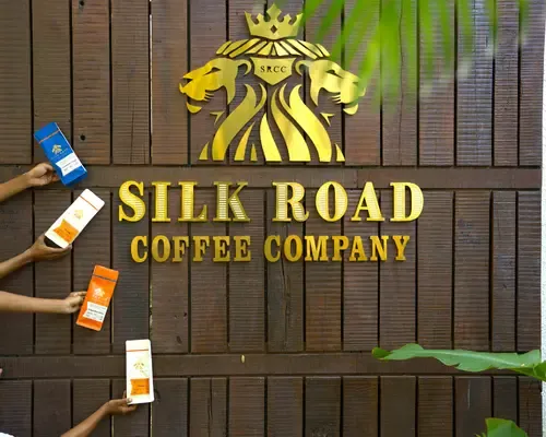
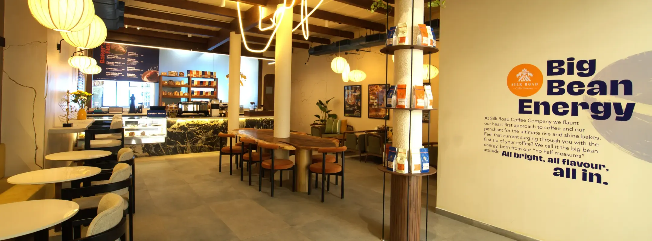
SRCC started with a strong concept and a logo, but no cohesive brand system. We turned it into a fully realised cafe brand — designing a visual and verbal identity that shows up consistently across cups, menus, walls, uniforms, and social. Every touchpoint built to feel unmistakably SRCC. Beyond the brand, SRCC needed reasons for people to keep coming back. We co-created festive and breakfast campaigns, plus strategic collaborations, that turned the cafe into a destination for experiences — not just a place to grab coffee.
The Challenge
Insights That
Shaped the Work
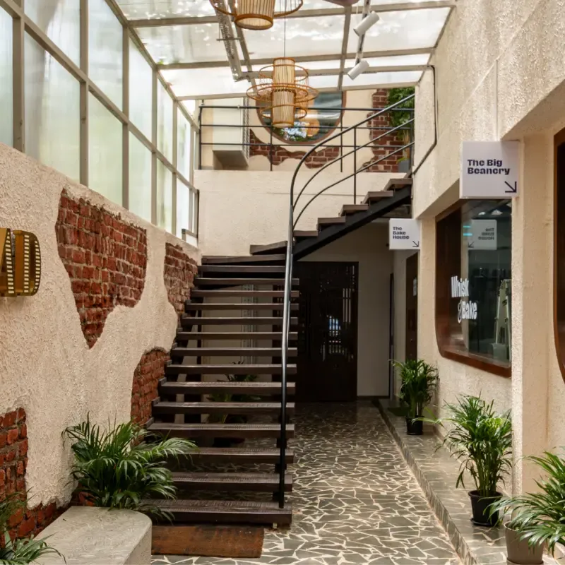
SRCC entered a crowded Mumbai cafe market with tremendous ambition but a fragmented starting point. In a city where specialty coffee is becoming a lifestyle category, standing out requires more than good coffee — it requires a brand that feels like a world people want to return to.
No Brand Identity System
SRCC had a logo and a couple of colour references, but nothing tying together packaging, interiors, or marketing. Every touchpoint looked different. Clients encountered a brand that hadn't yet decided what it was.
No Verbal Identity or Brand Voice
No tone of voice, brand story, or language that made SRCC sound as refined and coffee-forward as it aspired to look. Without a verbal identity, the brand had no way to build emotional resonance beyond the visual.
No Mechanism to Make People Come Back
No go-to-market strategy, no community touchpoints, no system to drive discovery, repeat visits, and emotional recall beyond the first cup. A great product without a reason to return is just a one-time visit.
Strategic Approach
A Whole-Environment
Brand System
We treated SRCC as a whole-environment brand — one that needed to speak with a single, coherent personality across every surface it touched. A systems problem, not a design problem.
01
Build the Brand as a System, Not a Style
Rather than designing assets in isolation, we built a visual and verbal identity from the ground up — one that could scale from a butter paper wrapper to a wall mural without losing its character. Every design decision, every line of copy, had to feel like it came from the same place. The brand guidelines were built to be used daily by the SRCC team, not filed away.
02
Design Campaigns as Mini Worlds
At Christmas: make the cafe feel wrapped in joy, not just decorated. At breakfast: own the morning ritual through a thoughtful menu, a participative launch event, and content that earns its place on a feed. Throughout the year: layer in value-aligned collaborations that make the brand feel bigger than its four walls.
How the Work Unfolded
Four Phases.
One Direction.
From brand foundations through identity, campaigns, and community — each phase built the world SRCC needed people to want to return to.
Phase 01
Foundation
Discovery & Strategy
Phase 02
Identity Build
Visual & Verbal
Phase 03
Campaigns
Activate
Phase 04
Community
Scale → Ongoing
The Work
Three Workstreams.
One Living Brand.
End-to-end brand language for a new cafe brand — across interiors, packaging, and communication, plus seasonal campaigns and experience-led launches. Every element built to feel like it came from the same place.
Visual Identity System
Every Surface. Every Scale.
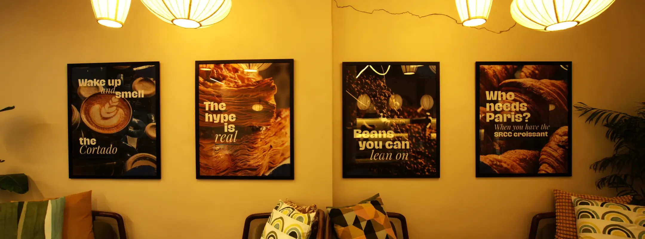
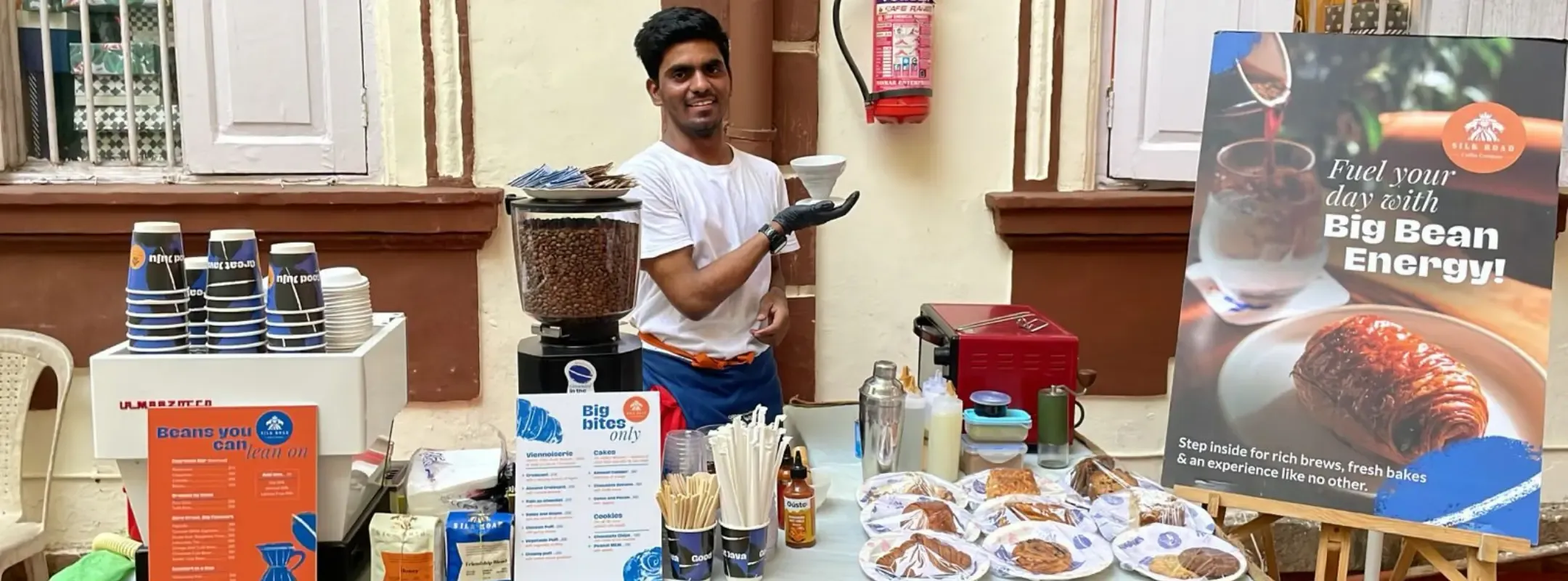
A complete visual language built from deep mood boarding — colour palette, typography, illustrations, and graphic elements. Packaging across bags, cups, coasters, butter paper, and delivery stickers. In-store across signage, decals, uniforms, and tent cards. Marketing across posters, invitations, social templates, and menus. One system, every touchpoint.
Verbal Identity & Brand Story
The Voice That Made SRCC Sound Like Itself
Brand positioning, brand personality, a founder story, and a tight brand line — all built from scratch. Brought into packaging, in-store elements, posters, and social so every line reads unmistakably SRCC. Visual and verbal brand guidelines created so future partners and teams can build new assets without diluting the brand.
Campaign Strategy & Experience Design
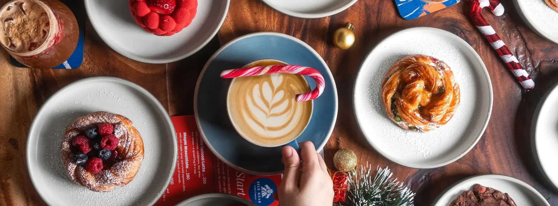
Christmas, Breakfast & Community — Reasons to Return
SRCC Christmas: full concept, creative, and strategy for a festive campaign including the SRCC x Gusto Cheese Danish with Truffle Oil collaboration and a Wrapped in Joy charity drive. Breakfast Launch: end-to-end rollout from menu trials to a participative event featuring mug painting. SRCC x Trove: a workshop series covering terrarium-making and coffee brewing, repositioning SRCC as a destination for culture and creativity.
One Brand,
Every Surface.
End-to-End Brand Language
The Impact
What the Work
Made Possible
One Brand, Every Surface
A complete brand system launched across all touchpoints — packaging, interiors, uniforms, social, and print. Every element feels like it came from the same place, giving SRCC a consistency most new cafes take years to earn.
A Signature Collaboration Item
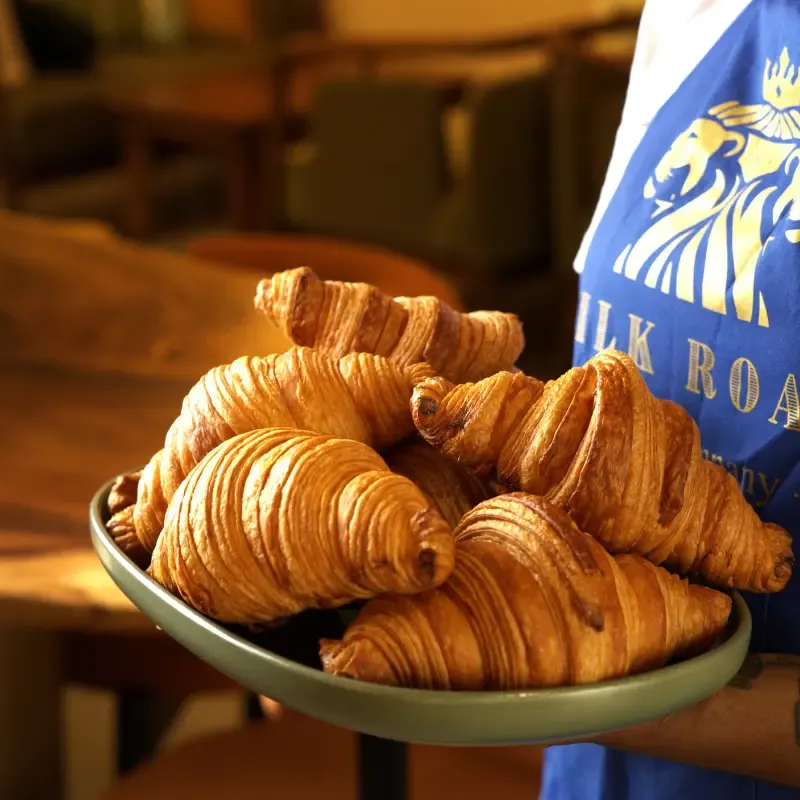
The SRCC x Gusto Cheese Danish with Truffle Oil — activated as part of the Christmas campaign — became a crowd favourite. The kind of product that earns its own regulars and gives the brand a story worth telling.
A Destination, Not Just a Cafe
The Trove workshop series repositioned SRCC as a place for learning and creativity — not just a specialty coffee stop. Community workshops gave people a reason to come back that had nothing to do with the menu.
A System That Scales
Clear brand management systems made it easier to maintain brand quality across new menus, campaigns, and collaborations. SRCC can now grow without losing its soul — the guidelines do the work of protecting the brand at every new touchpoint.