Case Study
Food,
Finished
Your Way.
Jimmy's had a product that was already selling. We built the brand, the system, and the world around it.
Jimmy's Dips & Sauces
4 Months
Brand Strategy · Identity · Launch
FMCG / Condiments
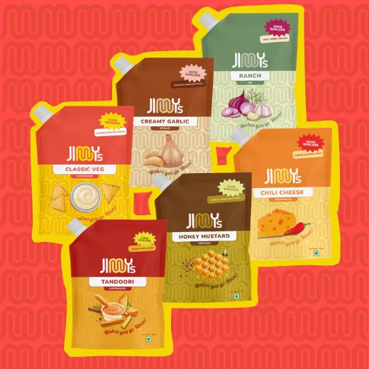
Positioning
“A product, finally given the brand it deserved.”
Overview
The Product Was Ready.
The Brand Was Not.
Jimmy's Dips & Sauces is a Mumbai-based FMCG condiments brand with a mayonnaise range that had been on retail shelves for years before it had a brand identity. The product was moving quietly, without any marketing behind it. No positioning, no clear voice, and no reason a shopper could articulate for choosing it over anything else in the same aisle. They came to us because they needed to figure out what Jimmy's actually was before they could tell anyone about it.
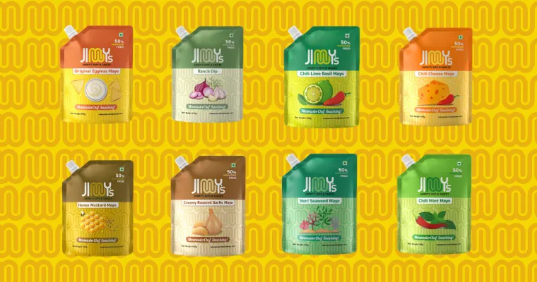
The Challenge
Two Ranges.
One Shot.
A Category With No Breathing Room
Most players compete on flavour variants, premium claims, and ingredient credentials. Doing the same thing would have made Jimmy's invisible on the shelf.
Two Ranges Launching Simultaneously
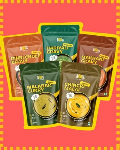
A repositioned mayo condiments line and a brand new ready-to-cook gravies range both going to market at the same time. Strategy, packaging, and launch planning all had to move in parallel.
Limited Inventory, No Distribution Partner
Everything had to be right before launch, not iterated after. No confirmed distributor, limited stock, and a compressed timeline meant zero room for vague thinking.
Strategic Approach
How We
Thought About It
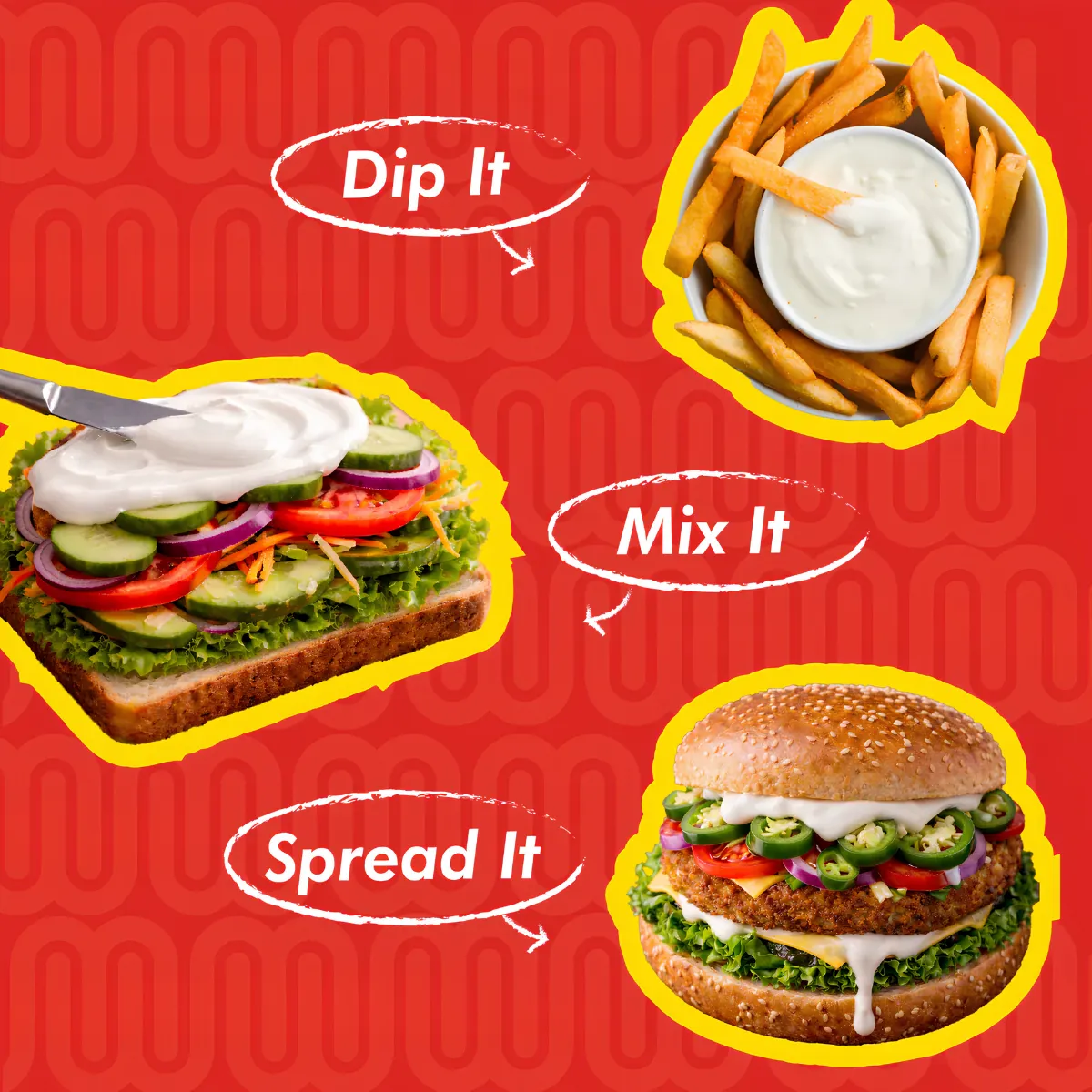
The condiments category is not won on ingredients. It is won on moments. We positioned Jimmy's around the moment no one else owned.
01
Own the Eating Moment
Jimmy's does not help people cook. It finishes food that already exists. The positioning, Food Finished Your Way, was built around a specific and under-owned moment: not cooking, but eating, when something on the plate needs one more thing to feel right.
02
Restructure the Portfolio
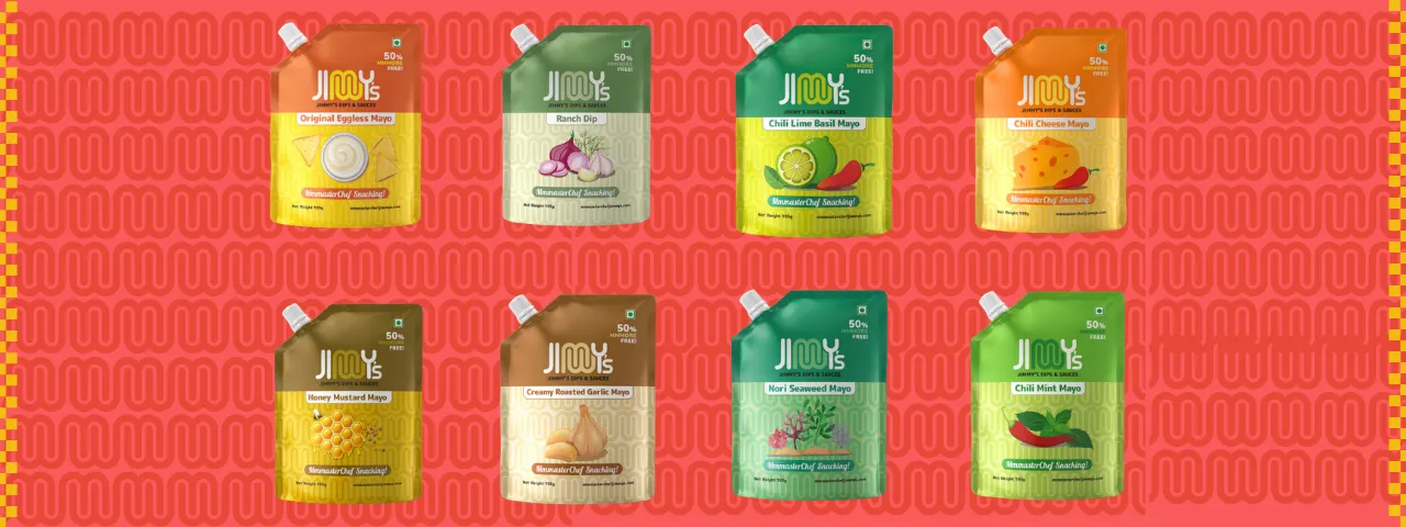
We sub-categorised eight mayo SKUs into dips, sauces, dressings, and mayo, changing the purchase logic from eight versions of the same thing into four distinct reasons to buy. The gravies range was positioned separately under a ready-to-eat architecture.
03
Build the Communication System
Tone of voice, visual identity principles, packaging hierarchy, on-pack communication logic, and channel-specific direction for retail, e-commerce, and social, all formalised so every touchpoint reads as one brand.
Understanding the Consumer
Not a Cooking Problem.
A Finishing Problem.
Across the category, Jimmy's sits at the intersection of four distinct but overlapping Indian consumer realities. The student in a hostel who wants basic snacks to feel like something. The working professional alone after a long day who needs a meal to feel complete in under five minutes. The working parent with weeknight dinner pressure and family expectations. The young urban shopper building flavour habits from scratch.
What all of them share is not a cooking problem. It is a finishing problem. Food already exists in their lives. They need one thing that makes it feel right. That insight shaped everything.
Packaging Direction
Hierarchy That
Sells on Shelf
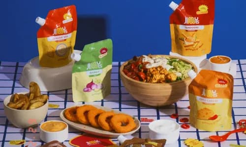
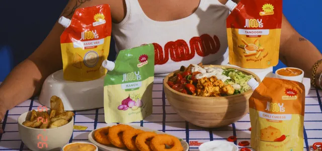
Most players in the condiments category treat packaging as information delivery. We treated it as brand storytelling. The problem was not the format, colour, or illustration. It was hierarchy and communication logic.
Front of Pack: New Hierarchy
Product name becomes the dominant visual element. Brand logo above it, umbrella line below. SKU-specific flavour descriptor and a single rotating badge replace generic promotional callouts.
Back of Pack: Communication Logic
Consistent category line across all SKUs. A best-paired-with callout rotating by flavour. Brand promise icons, illustrated cooking directions, and cleaner regulatory layout replacing text-heavy panels.
Gravies Range: Cohesion System
Cultural illustration and regional naming retained as strengths. Spice level callouts, illustrated directions, ingredient badges, and a visual system that coheres with the dips range on shelf.
Content Strategy
Jimmy Comes Home
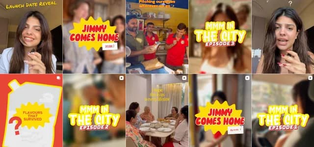
A founder-led content series built around the most honest possible product demo: real kitchens, real people, and zero script.
“She did not teach them how to cook. She just brought the gravy.”
The Series
10 Real Homes. 10 Episodes.
Gehna shows up at 10 homes across the city, unannounced-feeling and genuinely curious. She brings one gravy, hands it to whoever is in the kitchen that day, stays, chats, watches, and eats. The magic is in the ordinariness of it.
Release Strategy
One Per Week. Ep 03 Held.
One episode releases per week. Episode 03 is held for week three because it is the strongest episode and anchors the UGC activation window. WhatsApp community gets every episode before Instagram does.
Collaterals
The Emergency Eating Kit
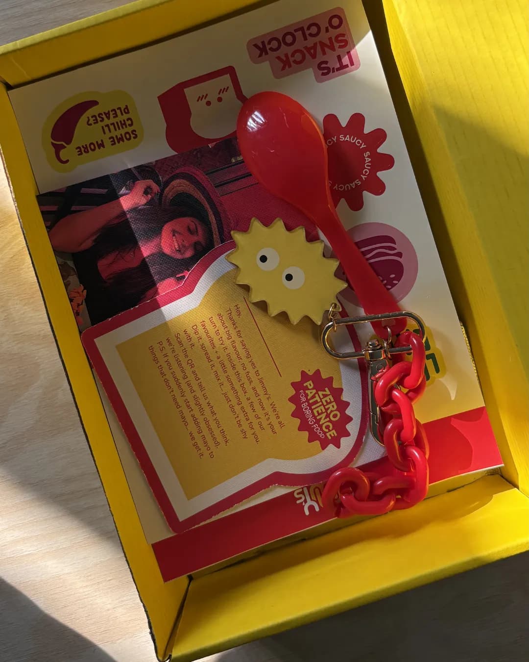
Gehna visits with the Jimmy's canvas tote, a sling and spoon. Every home gets left with the Emergency Eating Kit: a branded pouch that leaves a physical trace of the brand in real kitchens after the camera is gone.
Merchandise & Brand World
Objects That
Carry the Brand
The merchandise direction moves away from conventional branded apparel. Every object is something people keep on their person, a tool and signal that they are always ready to fix food.
The Emergency Eating Kit
A small pouch designed with first-aid kit logic but applied to food. Mini spoon, mini fork, napkin, and a slot for a Jimmy's sachet. On-pouch copy: In Case of Bland Food.
The Taste Test Spoon
A miniature spoon charm for bags, phone straps, and keychains. Tagline: For when food needs help. Designed to appear in content and real life.
The Drip Charm and Taste Tester Pin
A sauce-drip shaped collectible in flavour-coded colour variants, and an enamel pin for early community members and creators. Designed for repeat and seasonal releases.
The Jimmy's Ready-to-Eat Tote
Canvas tote with stitched pockets for a Jimmy's bottle, spoon, fork, and snack. Interior labels read Emergency Flavour and Taste Test. Extremely visual in content.
Impact and Outcomes
Everything Built
Before Launch.
Jimmy's launched in June 2026 with distribution aligned across Blinkit, Nature's Basket, and e-commerce. HoReCa and B2B outreach initiated. A brand that had been selling quietly without a strategy, a voice, or a system went into market with all three.
Founder-Led Content That Works
Content production shifted to a founder-led, real-kitchen format that proved far more aligned to the brand than produced advertising. The Jimmy Comes Home series established a content behaviour the brand owns rather than rents.
Community Before Broadcast
WhatsApp community established as the first touchpoint for all launch content before anything reached Instagram. The sampling programme created a direct feedback loop with early consumers from day one.
A System, Not Just a Brand
Four months produced the full infrastructure the brand scales from: positioning, packaging direction, communication system, consumer architecture, content format, merchandise world, retail activation, and community.