Case Study
Making Travel
Feel Like
Your Way.
In a category full of options, the brand that removes overwhelm wins. Bhomio set out to be that brand — and needed an identity that felt it from the very first screen.
Bhomio — Travel App
June 2023 – Oct 2025
Visual Identity · Brand System · App Interface Language
Consumer Tech / Travel
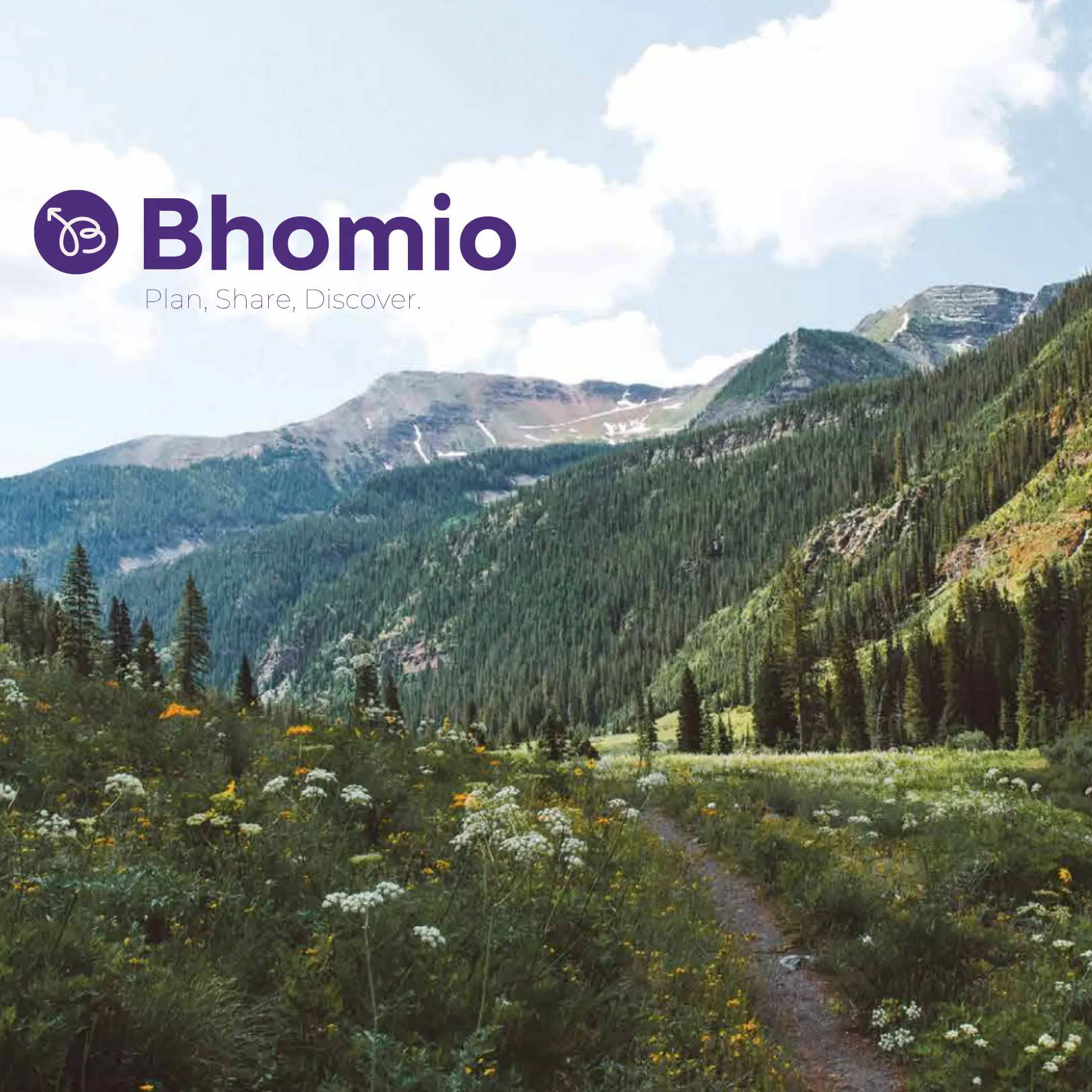
Philosophy
“Early-stage branding is not a luxury for startups. It is the foundation that makes every subsequent marketing activity more effective.”
Overview
Travel Planning
Should Feel Like Relief
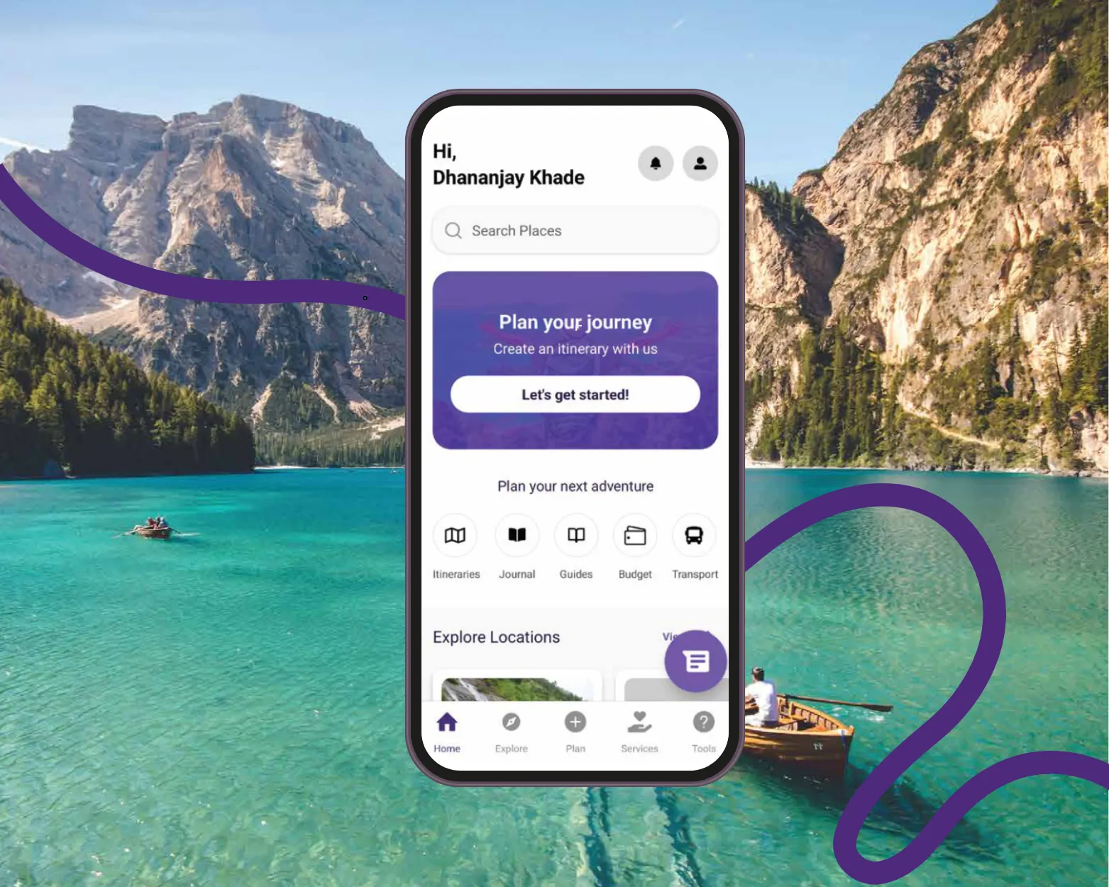
Bhomio was built to solve a problem every traveller knows: too many tabs, too much noise, too little clarity. Travel planning should feel calm, friendly, and exploratory — not like a second job. The challenge was translating that idea into a visual and brand identity system that worked at every level: as an app icon on a phone screen, as a colour palette that communicated ease and energy simultaneously, as icons that guided navigation intuitively, and as micro copy that made every interaction feel like it came from a warm, organised travel companion rather than a faceless platform.

The Challenge
Insights That
Shaped the Work
Travel apps are one of the most crowded categories in consumer tech. Every major player competes on inventory. The problem is that more options, without better organisation, produces more stress. Bhomio's insight was that the category was solving the wrong problem.
The Category Was Solving the Wrong Problem
Most travel platforms communicate like databases. Bhomio wanted to communicate like a person — a well-travelled, well-organised friend who genuinely enjoys helping you plan a trip.
Brand Feeling and Product Insight Had to Be the Same Thing
The brand needed to feel exploratory, warm, and full of possibility, while simultaneously signalling that Bhomio would be easier and less overwhelming than every alternative.
Identity Had to Function at Every Scale
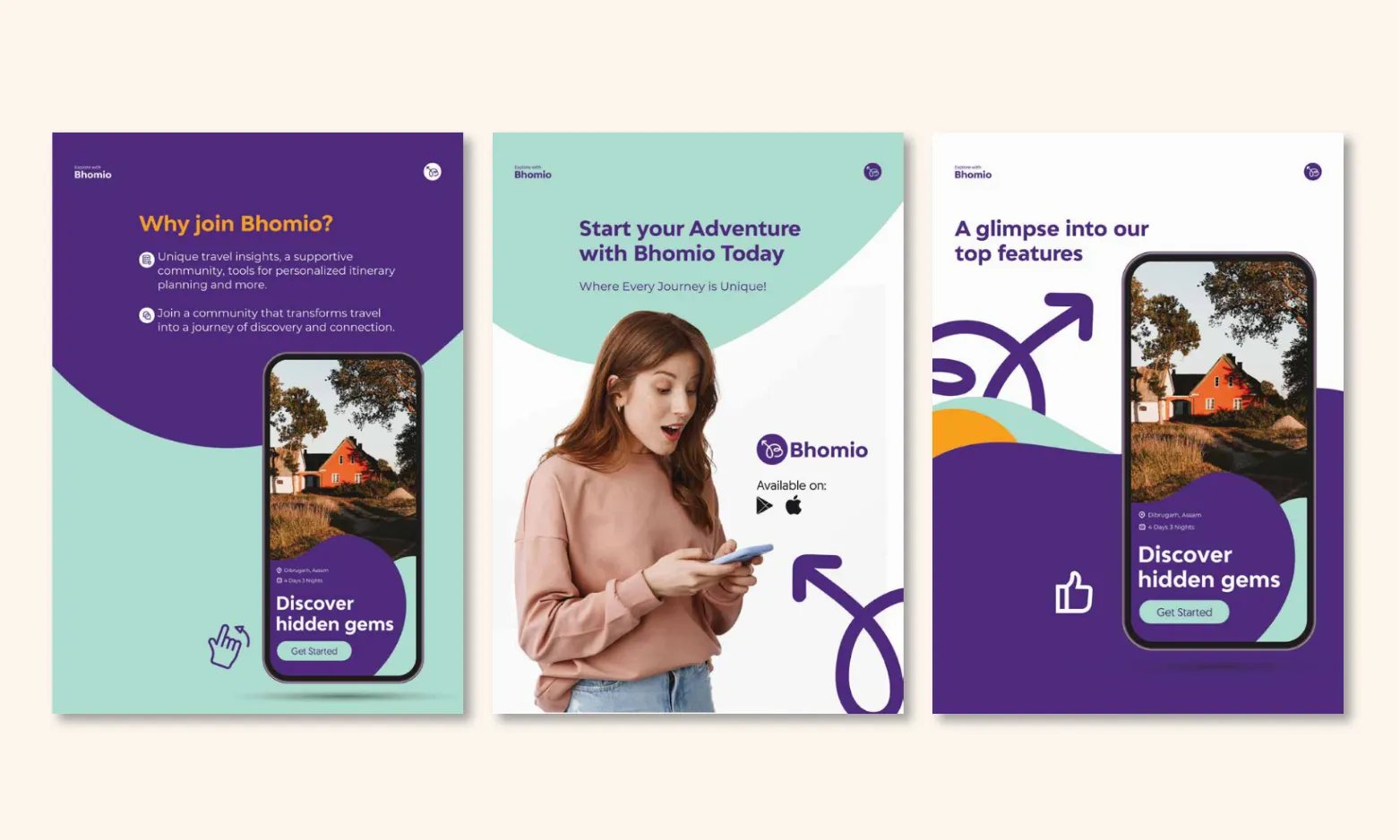
A brand identity for an app is not just a logo and some colours. It has to work as a 40px icon, a full-screen illustration, a navigation element, a marketing poster. The system needed to be modular enough to extend across all of these without reinvention.
Strategic Approach
One Governing Idea:
Ease with Energy
The brand should feel like relief, but also like anticipation. Every visual decision was tested against the question: does this feel like travel, or does this feel like software?
01
Use Identity to Signal Ease, Discovery, and Warmth
Rather than reaching for the expected palette of tech blues and corporate neutrals, we chose to build a colour and typographic system that felt genuinely exploratory — colours with personality, type with warmth, a logo that read as a destination rather than a product.
02
Build a Modular Visual System That Scales
The identity could not be a one-time design exercise. Bhomio would grow — new features, new markets, new channels — and the visual system needed to grow with it without requiring reinvention each time. We built the logo, colour palette, typography, icon set, and pattern library as a modular system: each element clearly defined, clearly documented, and clearly extensible.
How the Work Unfolded
Four Phases.
One Direction.
From brand strategy to a fully modular identity system — each phase unlocking the next, all aligned from day one.
Phase 01
Strategy & Positioning
Discovery
Phase 02
Core Visual Identity
Build
Phase 03
Iconography & Patterns
Extend
Phase 04
Interface Language
Activate → Ongoing
The Work
Three Workstreams.
One Cohesive System.
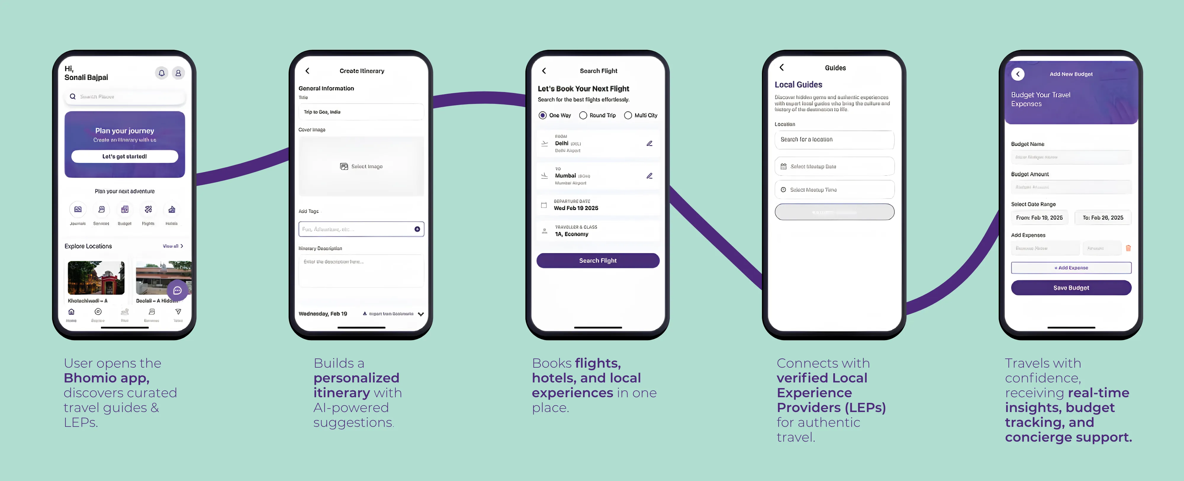
Brand identity and interface system for a new travel app — from logo and colour to iconography, patterns, and the personality woven into every screen. Strategy, creative, and execution treated as a single workstream.
Core Visual Identity
Logo, Colour & Typography
Logo and app icon with clear usage rules. A 3-layer colour system built around trust, energy, and exploration — deliberately avoiding the generic tech-blue trap. Adlinnaka for headings, Montserrat for body: sophisticated enough to trust, approachable enough to enjoy.
Iconography & Patterns
Custom Icon Library & Brand Patterns
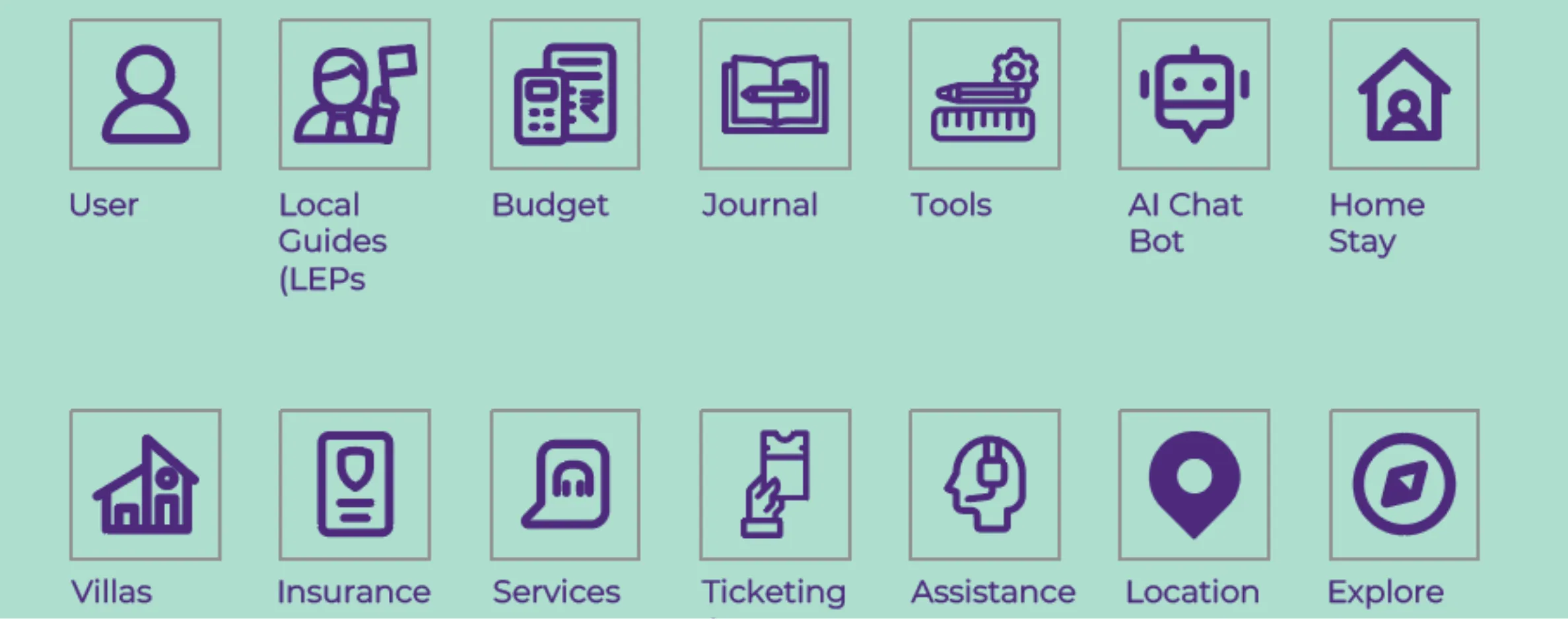
A full custom icon set covering all core app actions — flights, hotels, local experiences, itinerary management — built to the same grid and stroke weight throughout. Brand patterns extending the identity into social graphics, loading screens, onboarding illustrations, and campaign assets.
App Personality & Interface Language
Travel, Your Way Framework
Every screen, label, empty state, and error message written and designed to reinforce the feeling that Bhomio is working for you, not the other way around. Micro copy and sign-offs — including the brand's sign-off “Travel, your way. With love, Bhomio.” — applied consistently across every interaction.
Travel,
Your Way.
Core Brand Idea · Interface Framework
The Impact
What the Work
Made Possible
3-Layer Colour System
Primary, secondary, and accent palette built for trust, energy, and exploration — deliberately avoiding the generic tech-blue trap. Colours drawn from actual travel: sky, land, water, warmth.
Full Custom Icon Library
All core app actions and content categories — flights, hotels, local experiences, itinerary — built to the same grid and stroke weight. Friendly enough to feel welcoming, clean enough to be instantly legible at small sizes.
Adlinnaka + Montserrat Pairing
Typography optimised for UI and brand readability. Adlinnaka brings personality and warmth to headers; Montserrat brings clarity to information-dense contexts. Sophisticated enough to trust, approachable enough to enjoy.
Brand Aligned From Day One
Bhomio launched with visual system, tone of voice, and app personality all built in parallel — not retrofitted. A modular system that lets the product add features, enter new markets, and run campaigns without starting from scratch.